If you have any doubt that design of everyday things is the most important cultural movement of our time, then you need to look up the most valuable company in the world today, which is ofcourse, Apple. We want our tools to work flawlessly and naturally. Open source projects are catching up too.Elementary OS promises to finally make the Linux Desktop accessible for everyone. Many open source web applications like Ghost CMS, Taiga and the upcoming Flarum have designers in their core team. If you want to take a better look, check out BeautifulOpen.
Taste
A couple of months ago, we decided that we need to refocus on design for our open source ERP project, ERPNext. ERPs are known for having the worst user designs and we wanted to change that. Usability in ERPNext was already better compared to many other products, but we knew we were far away from having design as our strength. All of us use Apple products for developing our applications and we use GitHub to manage our team and collaborate with the community, both of which have been very thoughtfully designed. It was only a matter of time before we started comparing our designs and user experience to what we were used to.
Reading about and understanding work of great designers like Dieter Rams also helped us build a strong taste for good software.
The Brief
The next step was to make a brief for the project. Since we already had a fairly mature project, we did not have to start from scratch. Since ERPNext is a data driven application, the two most important screens are the List and the Form. A List is a list of anything, like an Invoice or a To Do, A Form is the actual Invoice that you can create and view. There were a bunch of other screens like the home page, login screen, setup pages, charts but we kept the focus on the two important screens. We took a bunch of screenshots of our current design, highlighting these screens and posted them on a GitHub Issue. We also highlighted the fact that we did not want to go for a radical redesign, keeping our current users in mind. What we really needed was cleanup and polish.
The List and Form Views
The Designer
Now that we had a good idea of what we needed, the next step was to identify a good designer. This seemed to be the most diffficult step. We are not a part of any ecosystem and there is no mentor we could ring up and ask for recommendations. But, we had two leads. Three years ago, we had worked with a wonderful design firm, Studio March which based in Pune (150km from where we are based) for our website. And the other one was ofcourse Dribbble. On Dribbble, we looked up screenshots of designers who had worked on business apps, invoicing apps or project management apps and we had detailed talks over Email and Skype with around three designers. Since we already had a brief, we found that a lot of designers were ready to talk.
Finally we shortlisted two firms, 3Drops from Sweden which we discovered on Dribble and Studio March. Both the companies agreed to work within our budget constraints. Based on the brief and budget, they had estimated around 2 to 3 weeks of work. We selected Studio March since we had already worked with them in the past and we loved their work, we could meet face to face, and also they promised deliver both the screenshots as well as a CSS based style guide, which would be very useful for us to extrapolate the designs to other screens. So we signed a contract went ahead.
The Process
It is always fun to understand the creative process of different people and we really enjoyed our experience with Studio March. First the head of Studio March dropped in had a detailed chat with us. He understood our team, where we came from, where we wanted to go and what our tastes were. Next, they spent a some time playing with the app in its current state to understand all the different ways a user might discover, use and navigate through the app. Then they went on started fleshing out the screens from scratch.
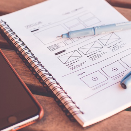
From Wireframes to Detailed Screenshots
In their redesign, they simplified a lot of the visible functionality. They had the courage to throw away things that were not really needed, hide menus that could be hidden, and use the screen space a lot better. Suddenly the app felt a whole lot lighter and natural. With each iteration, they added the remaining functionality and depth into the design. Since this was a never ending process, we realized that time was running out. After two to three interations, we decided to go in and implement some of these designs go get a better understanding of how the designs worked.
In a space of two weeks, we were able to mockup some of the key functionalities in the design. We removed a toolbar, added a sidebar, cleaned out the top menu system and added breadcrumbs. As soon as the design started taking life, we realized the great work done by Studio March team. There was very little we needed to change from their original designs.
They also dropped to our office a couple of times for detailed chats. We had discussions on the layouts and the elements that the design could not cover. Citing engineering effort, we balked on a couple of their suggestions, but they pushed us to work and implement the original designs. Their passion and commitment to the details clearly rubbed off, and the user experience went up a few notches.
Feedback
As soon as we nailed down the important screens, we decided to make a small video to introduce the design. It was initally just a for our monthly Open Day presentation, but we spent a couple of hours polishing it on Keynote and iMovie. For fun, we even added Apple-like adjectives like “beautiful” and “smooth”. We sent out the video to the mailing list and got awesome feedback. It was a great way to notify the community we are working on something new as well as create a buzz. We even got 20+ comments on our blog. Here is the video:
Conclusion
We learned that executing good design is not impossibly hard or expensive. The entire redesign process was suprisingly smooth. We went from preparing the brief, selecting the designer, working on the designs and releasing them to the community in a span of two months. We were also lucky to work with a great design team.
If you are working on any software project, and don’t have designers in your team, we hope this inspires you to go out and get a makeover.
Here is a working preview of our new design, which is due release mid-Feb.


