In a startup, the design is usually an afterthought after the more important challenges of business and technology are solved. Which means by then the design is more like a band aid or a lipstick on the proverbial pig. Probably the main reason why products here still lack that world-class feel, even though they are better in terms of features and performance.
A successful product usually has the right blend of usefulness, ease-of-use and engagement or emotional connect through aesthetics. For example, Facebook might score high on each of the three attribute, while a game like Grand Theft Auto may deliberately keep the ease-of-use difficult. Each of these attributes should be part of the product roadmap at the onset. By how much should you dial up or down each attribute or in other words what is the overall design vision? And who will be responsible to achieve this vision?
We feature the first of several quick audits to get a conversation started around the importance of design when you are a startup. We did a quick review of @Bubbles, a six month old startup trying to re-imagine email by bringing it closer to the art of letter writing from the good old days. It enables tools for your creative expressions, allowing you to scribble your thoughts, stick photos, sketch cartoons, draw diagrams, and attach sticky notes to your email as you would do on a physical letter.
We evaluated it on 4 key user experience parameters.
How well does it COMMUNICATE to users?
To reduce user’s memory load, it is important to use terms & language that connects to their existing mental model. Once you have adopted a mental model or a metaphor, then try to be consistent.
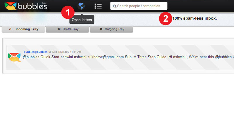
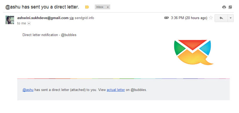
- Terms like “Open Letter”, “Direct letters” are not commonly used in context of letter or email writing and hence can lead to different interpretation. It also adds to the learning time for the user.
- Similarly, “No Posts” and “100% Spam free inbox” violate the mental model of letter writing. Either use a “letter” or “email” metaphor but use it consistently.
How easy is it to NAVIGATE?
Ease of use is vital. The user should always be in control and take the intended direction to perform a particular task. To be able to do this, it is essential that the user understands the flow of screens or sequence of actions.
- The incoming and the outgoing mails have the same look and feel, which leads to some confusion. The status of the site or where you are at a given point is not well communicated.
- Same page for public & personal letters – The sending route should be selected after the letter has been written. There could be multiple paths to doing this too.
How easy is it to INTERACT?
The information structure should make relevant connections between different pieces information and tools (features) to enable user to achieve desired goals.
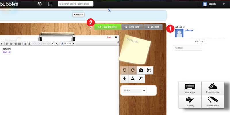
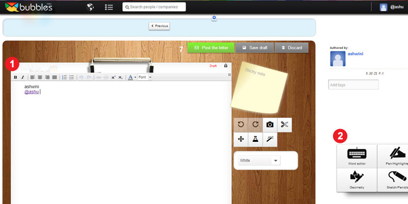
- Editing tools for the letter are scattered all over the page. A fixed layout for the toolbar would make it easy to use. Some drawing tools like – copy, paste, resize, rotate, etc could be integrated at one place to create a seamless experience.
- Every selection or user action should be followed by an appropriate feedback. For example, when a user selects a Pen tools, there is no feedback that it has been selected.
Does it create the right EXPERIENCE?
Overall, it is about experience.
- Sent mail is a personal letter as well as a promotional letter for Bubbles, so it should be designed so as to attract more customers, who are not currently on Bubbles.
- Keyless Login creates a good experience but the learning curve should not be high.
Undoubtedly, Bubbles is a much better designed product than most. There is a design sensibility with some effort and thought behind each screen, icon and color palette. However, it seems that though there was an emphasis on graphic design (engagement or aesthetics), it could still be improved significantly with some thought on interaction design (usability).

