A logo is one of the most visible faces of your brand. In other words, the logo is most likely to be your most frequent and most visible brand representative.
Ideally, a logo should clearly state the following:
- Who you are
- What you do
How the logo is designed and how well the messaging is in the tag line will create the first impressions about the brand’s personality.
Right from the time you exchange business cards, or when you release an ad – in print, TV or online, or when someoen sees your logo on the app store or when someone visits your site, it is often the name of the company, represented by the logo + tag line that will be noticed for the first time, and that is what starts creating the story about your brand in the users mind. While a badly designed logo may not necessarily send the wrong impression, a well-designed logo will most certainly create a favorable impression.
If your logo and UI is not good, and therefore if the assumptions about you start off on an incorrect note, it is usually very, very hard (and certainly very expensive) to change that perception.
For startups, it is critical that the logo and the tag line be designed well. This is because when you are new, most people would not know what you do and who you are. Hence, when they interact with your brand for the first time, it is usually the logo unit that will set the first impressions about what you do.
Similarly, with tag lines. Tag lines should be used to communicate clearly what you do. E.g. “Online fashion store” or “Analytics for SMEs”.
Often entrepreneurs make the mistake of using a tag line which is nothing but a smart set of words with no reference to what you do. This is of little use in brand management. E.g. for a healthcare brand, if the tagline said ‘We care for you”, it really means nothing to anyone and does not establish what the brand does. Instead, if the tagline were to be specific saying “Your neighborhood childcare clinic’, there is specificity in communicating what the promise is.
It will be ideal if your tag line can also communicate your value proposition. E.g. “Affordable cardiac care.”
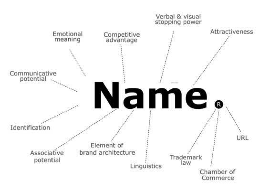
Likewise for brand names too. Decide on the name for your startup very, very thoughtfully. Give it as much importance as a parent would give to naming a child. YOU will have to live with that name for life… even if the startup fails and shuts down.
Ideally, a name should give your intended users/customers a clear idea of what you do. e.g. Make My Trip or Naukri.com. It should be easy to pronounce for all people across geographies and it should, as best as you can research, mean the right thing in all languages.

Ideally, it should be short, and should sound nice.
More importantly, the domain should be available. If not, trying to create a ‘compromise url’ (e.g. abc-info.co) is not very useful.
The sound should be relevant to your audience. E.g. if it is an enterprise solution, it should sound very professional and solid. If it is a fun thing for teenagers, it should sound fun.
Likewise, the logo design for that name should also reflect the personality that is relevant for the intended audience.
All this is expecially more relevant for product companies, as unlike services companies who often have the opportunity to sit in front of the customer to help create the first-impressions and communicate the value proposition, product companies depend only on the customer’s self-analysis of who you are based on what your touch points look like. And logo and brand name are often the first touch points. After all, marketing is the art of managing stakeholder perceptions.


